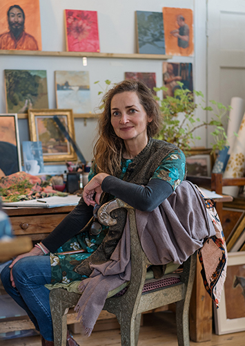
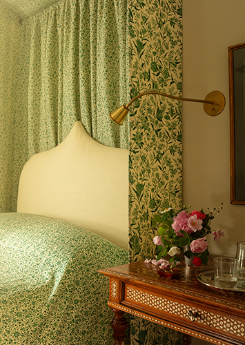
A distinct colour palette runs through Soane Britain’s fabric and wallpaper collections, enabling clients to pull together a host of style and colour combinations from within the range of prints, plains and weaves. The core colours – azure, raspberry, ochre, chestnut and emerald – are largely drawn from the Eastern Mediterranean and North Africa. Creative Director Lulu Lytle takes an authentic approach: shades in the collection trace back to myriad sources, whether an oriental painting or overseas expedition. A common thread is the depth and richness of the hues found in the Soane palette and a requirement that all should be, she says, “joyful and uplifting.” Here Lulu talks about the use of colour at Soane Britain.
COLOUR INSPIRATION
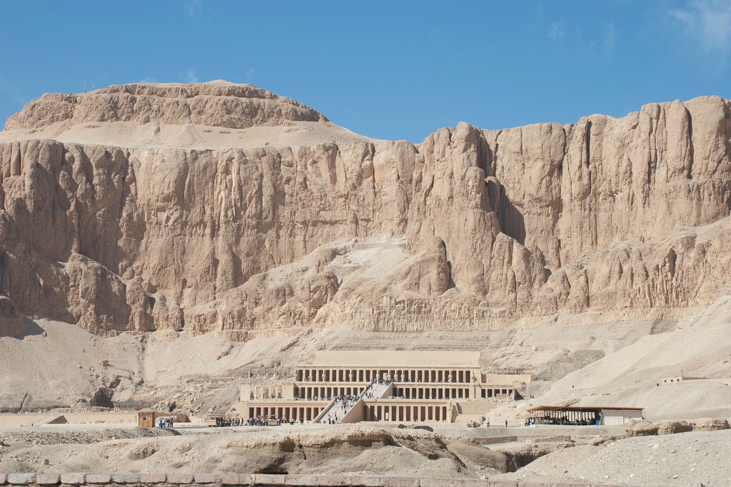
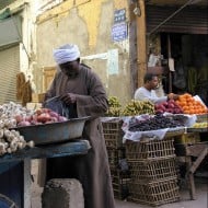
I’ve always adored blues and greens, the fundamental colours of nature. Contrary to the old saying, I think they work together beautifully and often combine them. As a child I was exposed to lots of pattern – all our bedrooms were wallpapered – and colour. My mother, who once remarked, “raspberry’s just a neutral”, used many deep pinks around the home and clearly left an impression, since they feature strongly in the Soane fabric and wallpaper collections. Later travels to Egypt introduced me to a favourite combination of pale blue and buff (the breathtaking sight of the soft sandstone of the Temple of Hatshepsut set against the blue sky) and glorious jewel colours (vivid hues that dazzled me at the Aswan market).
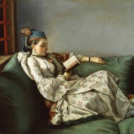
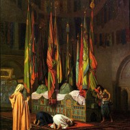
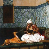
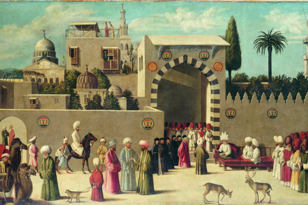
I developed a passion for oriental paintings and the rich reds, greens and many shades of blue used continue to inspire my work today. I am particularly fascinated by the depictions of opulent buildings and interiors of the Ottoman Empire, from the watercolours of David Roberts to the intensely rich oils of Liotard. Ingres, Gaugin and Matisse are also wonderfully inspiring – I am constantly amazed by their brilliant use of colour.
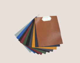
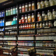
Of course, inspiration is always around – in the delightful showroom flowers supplied weekly by The Land Gardeners or the tubes of multifarious paint colours at my favourite art suppliers, L. Cornelissen & Son. Soane Britain’s collection of Old Flax weaves (currently 23 colours and counting), reflects the broader Soane palette, allowing clients to combine these plains with our patterned prints.
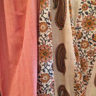
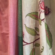
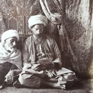
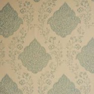
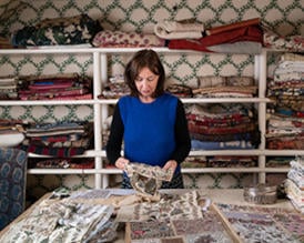
I like interiors to be uplifting and create fabrics that elicit a joyful feel. Many of Soane Britain’s prints are re-worked patterns found in antique textiles I have collected. Sometimes the colours are perfect and copied faithfully, but often they are too dowdy for modern tastes. For example, in developing Paisley Stripe, we retained the original colours but adjusted the shades: drab red became a warm watermelon, a dull yellow became a rich ochre and so on. Elsewhere, the colours are entirely new creations: Ottoman Scribe is a design lifted from a hanging in the background of a black and white photograph of a North African interior in 1880. I had no clue as to the original colours, so they are composed entirely from my imagination. Recently we have introduced a new approach to some of the Soane prints, producing them in different shades of one colour, for example in Dianthus Chintz Lapis and a forthcoming green version of Tendril Vine. The resulting look and atmosphere of the print can be remarkably different.
COLOURING NEW DESIGNS
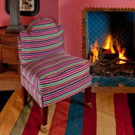
Deciding on colour combinations is a very personal process based on my gut instinct. I know that ultimately my preferences may possibly be bolder than many would choose. For example, the jewel coloured Damascus Stripe is one of my all time favourite fabrics, but not the most successful commercially! Whilst it’s dangerous to design by consensus, I do trust the instincts of the Soane team who sometimes rein me in a bit. They work closely with clients and understand what they want to see more of. For example, there is currently a great appetite for Azure.
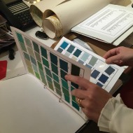
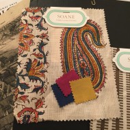
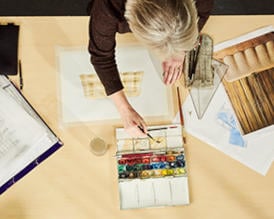
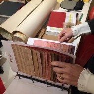
We work from a file of handpainted colour ‘chips’ provided by the printers – I never tire of leafing through it. The little squares of colour are tried out in different combinations according to the number of colours in a planned print (this can range from 1 in Pineapple Frond to 12 in Paisley Parrot). My choices can raise eyebrows and the printers balk at a colour ‘clash’. Sometimes it works, other times it is a total disaster. We are not driven solely by what will sell and I think it’s important to experiment – the most unlikely combinations can have a certain magic. There’s a great element of trial and error and we’ve sometimes had to re-colour a print repeatedly before being happy with it. For example, the new Paisley Stripe that we are launching in shades of blue for Spring 2017 suffered countless strike-offs that were just hideous! Shades that blended beautifully on the chips just didn’t work when put into the pattern.
The choice of a base cloth is also a key consideration as colours can appear very different printed on say, Stone Linen as opposed to Mutka Silk. Tendril Vine is a good example of this. Effects can be exaggerated in different climates, for example on the West Coast of the USA where our clients tend to prefer a lighter, whiter base cloth. Soft off-whites that look ethereal in England can make a print appear dirty in bright tropical sunlight. The flexibility offered by Soane for clients to order prints on different back cloths is invaluable in an international market.
LATEST COLOUR DEVELOPMENTS AT SOANE
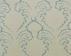
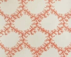
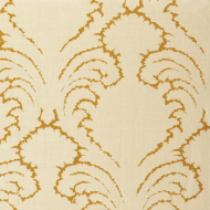
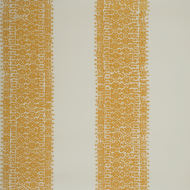
We have recently added Indian Yellow – a warm and sunny yellow – to the Soane palette. Whilst our core colour Ochre works well used as a line (it’s the bestselling colourway in Pineapple Frond wallpaper) or as a small element in a print, we found it was too brown when introduced to larger areas. The wide stripes in Fez Stripe and bold print in Scrolling Fern (a new fabric and wallpaper design due to be launched in Spring 2017), called for an intense yellow and so Indian Yellow was created. We adore this uplifting colour and will also be adding it to the Seaweed Lace fabric and wallpaper colourways. Perfect for those lucky enough to live by the beach!
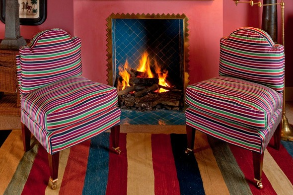
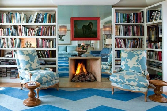
Top gallery: Lulu Lytle’s den at home with her favourite Soane fabric, Damascus Stripe on Cub Chairs; ‘The Visit of the Venetian Ambassadors in Damascus’ (1511); View of the Temple of Hatshepsut photographed by Ian MacKellar, Flickr; Lulu Lytle’s sitting room in a favourite colour combination of blue and buff.

